Today’s users live on their phones and your website should too. Our mobile-first web development approach ensures your application loads fast, looks sharp, and functions seamlessly across all devices. From responsive layouts to optimized mobile UX, we craft digital experiences that start with the small screen and scale beautifully.
Mobile-First Web Applications
Build for Mobile First. Scale for Everything Else.
Modern web users expect mobile-first. We design and develop websites and applications that don’t just shrink to fit small screens, they're built for phones first, then scale upward. Our mobile-first approach ensures speed, responsiveness, and usability from the ground up so your users get a great experience no matter what device they use.
Whether you're launching a new product or optimizing a legacy website, our team delivers mobile-optimized websites that are responsive, fast, and built with mobile performance as the top priority.

Mobile-First Development Services
Every pixel we design, every line of code we write, and every component we build starts with one question: “How will this perform on a phone?”

Design That Starts with Mobile
We don’t design a desktop website and “make it fit” a phone. Instead, we design your website for mobile users first ensuring content hierarchy, image sizing, buttons, and interactivity are perfect on small screens. The result? Websites that feel made for the modern world.
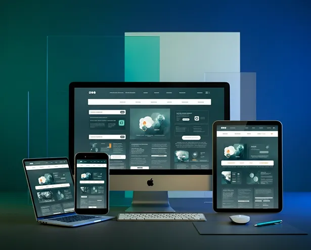
Responsive Web Development
We build applications that adapt beautifully to any screen size. From mobile phones to widescreen desktops, your site will look and function exactly as it should seamlessly and consistently.


Mobile Performance Optimization
Speed matters. We optimize everything—scripts, images, fonts, animations—to ensure your web app loads fast even on slower mobile connections. Your users won’t wait. And neither will Google.

What is Mobile-First Development?
The mobile-first approach means designing and coding for small screens first, then scaling upward. It reverses the traditional “desktop-first” method and focuses on how users actually experience the web today—on phones, on the go, often with limited data or slower connections.
-
 Load faster
-
Rank better on
Google (mobile-first indexing)
-
Offer cleaner UX
-
Convert more
mobile
users
-
Scale more
efficiently across devices


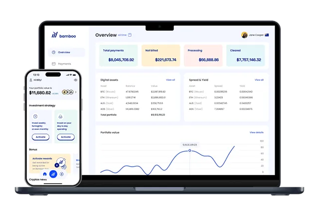
Who We Build For
We’ve helped startups, enterprises, and organizations in a wide range of industries rethink their digital experience starting from mobile.
Real Results. Real Clients.
Transparent Development Process
From wireframes to launch, we keep you in the loop:
Discovery & Strategy
Define goals and audience
Design & Prototyping
Create mobile-first mockups
Development
Code, test, optimize
QA & Launch
Ensure flawless performance on all devices
Post-Launch Support
We stick around for improvements
Our Tech Stack
We use modern tools and frameworks to deliver high-performance, scalable, mobile-first responsive design:
 HTML5
HTML5
 CSS3
CSS3
 JavaScript
 React
React
 Vue
HTML5
CSS3
JavaScript
React
Vue
Vue
HTML5
CSS3
JavaScript
React
Vue
 Node.js
 Laravel
 Django
 WordPress
 Headless CMS
 Vercel
 Netlify
 AWS
AWS
 Cloudflare
 Lighthouse
 GTmetrix
 WebPageTest
Mobile-First vs Responsive Design: Explained
Let’s clarify the confusion. A responsive website adapts to different screen sizes but if it’s built desktop-first, mobile performance often suffers.
In contrast, a mobile-first design means every decision, content, layout, structure is made for mobile first. This leads to better performance, cleaner UX, and more focused content.
We don’t just shrink things down, we build up from the ground.
From Legacy to Modern: Mobile-First Migration
Already have a desktop site? We can help.
We specialize in transforming outdated, desktop-centric websites into sleek, modern, mobile-first applications. Whether it’s a full rebuild or a strategic upgrade, we’ll guide you through the transition without disruption to your users or rankings.
Get Started
Progressive Web Apps (PWAs)
Looking for app-like functionality without the high cost of native development?
Offline support
Home screen
installation
Lightning-fast load
times
Push notifications
Our blog covers key topics in web development, UI/UX, and performance. Here are some recent posts:


Let’s Talk About Your Mobile-First Project
We make it easy to get started.
Here's how to begin:

Tell us what you want to build or improve. We'll listen and ask the right questions.
We’ll review your current site or product and provide clear recommendations on how to improve or transition to mobile-first.
We’ll plan, design, develop, test, and launch your new mobile-optimized website and support you post-launch too.